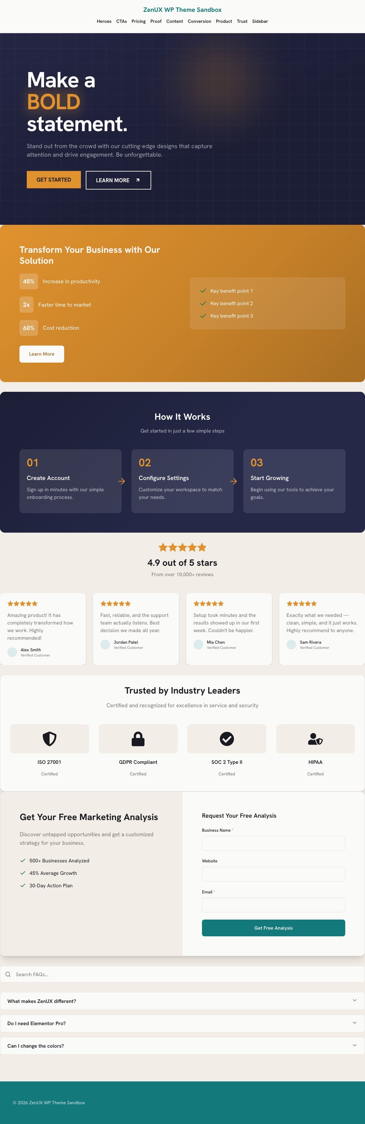
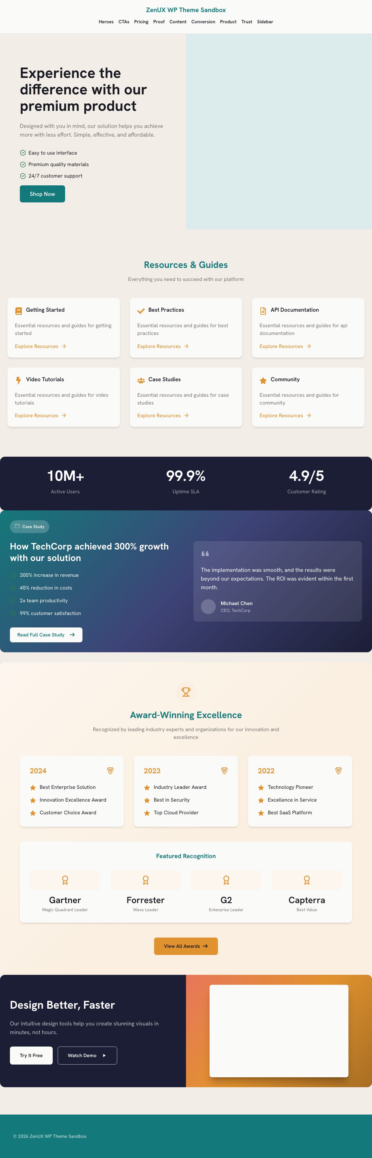
46 production-grade pattern widgets that inherit your brand automatically. Drop a section in and it's already on-brand, already responsive — and already working.
The pattern library your page builder should have shipped with.
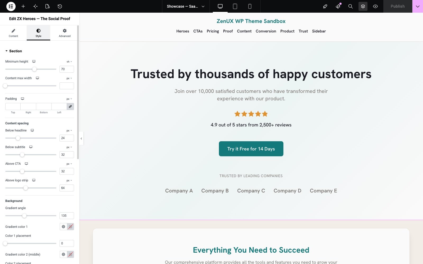
Each pattern lives in Elementor's Patterns tab as a real widget with a full style panel — per-state controls, overlay layers, decoration system. Not a template you have to un-break.
Bold, split, video, gradient — full-bleed openers with token-driven gradients and dedicated overlay controls.
Banner, split, and card CTAs that pull their colors from your kit — the ask always looks intentional.
Testimonials, logos, stats, live Google ratings — plus the Proof Stack composer to combine them into one section.
Contact, conversational, lead-gen — preset field sets with a shared server-side handler. They submit, today.
Tier cards, comparison table, enterprise band. Check-marks, ribbons, and a duo layout in the same widget.
Feature panels, numbered process steps, category cards, benefit bands — the middle of the page, solved.
Multi-step forms, social-proof signups, limited offers with live countdowns, lead magnets with download delivery.
Showcase and quick-view layouts, hover-zoom feature cards, category tiles, featured grids — Woo-ready.
Security features, compliance certs, privacy pillars, awards — the credibility layer most sites never build.
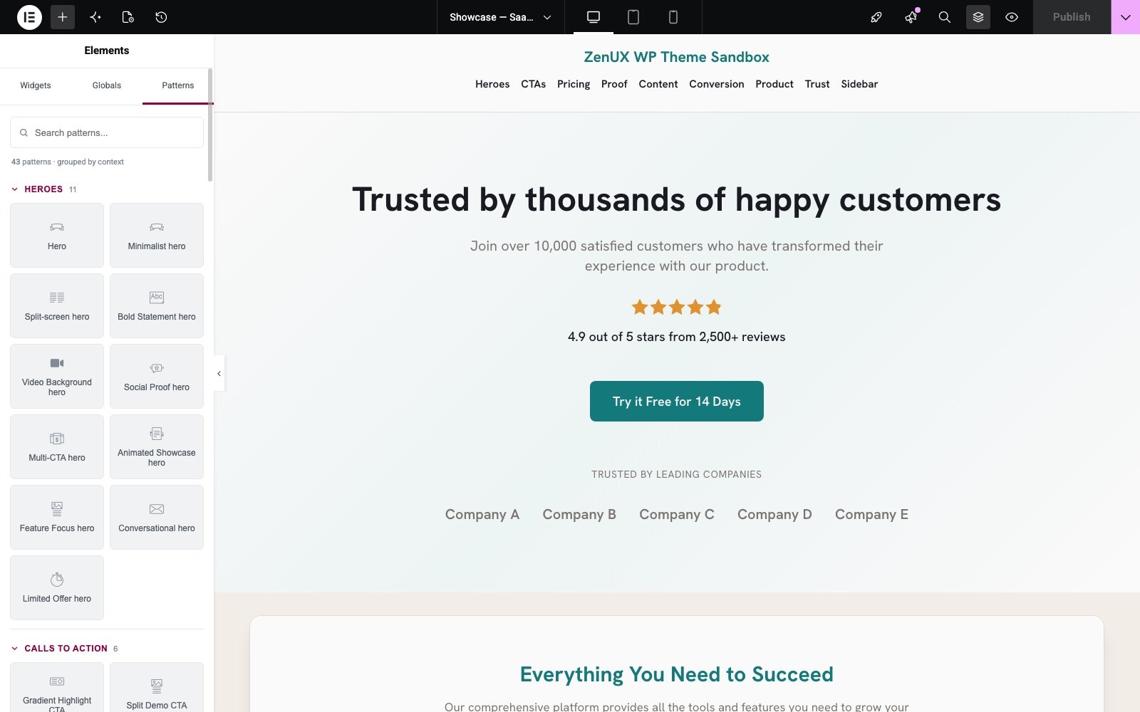
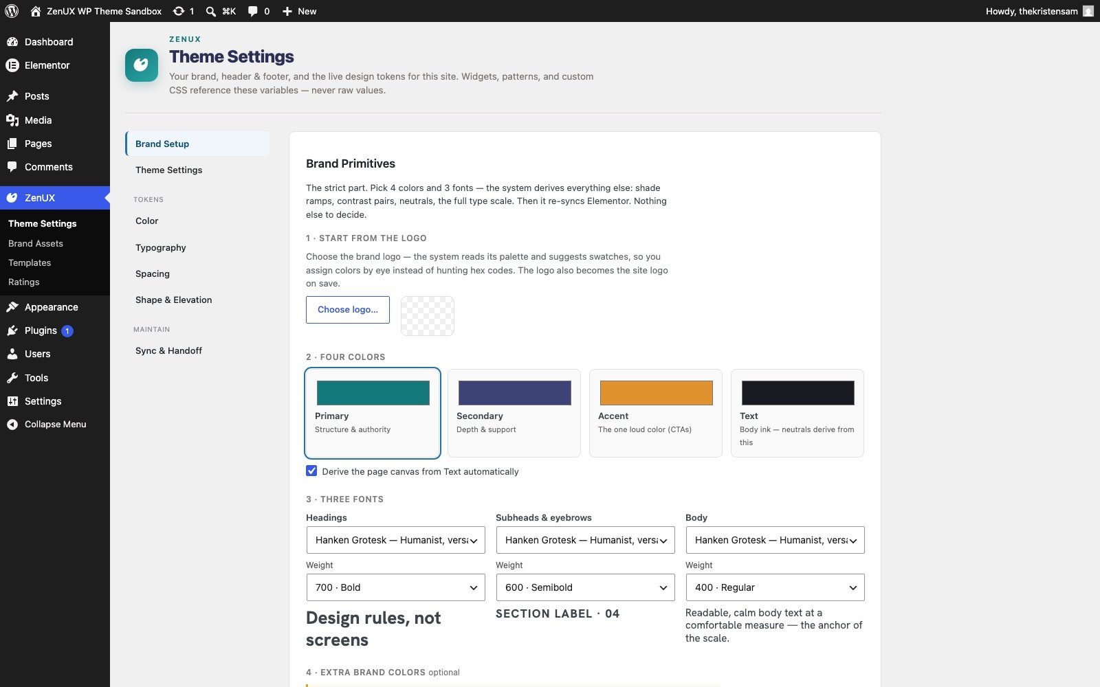
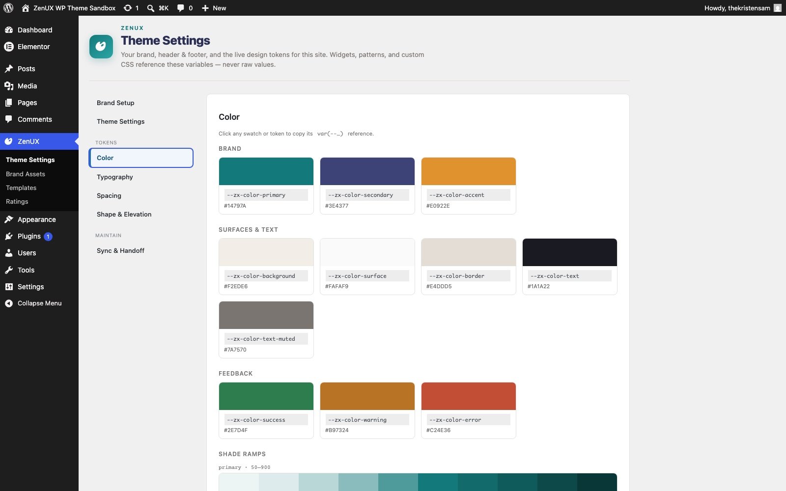
Straight screenshots from a live install — the Patterns tab in Elementor, a pattern's style panel, and the Theme Settings that drive it all.


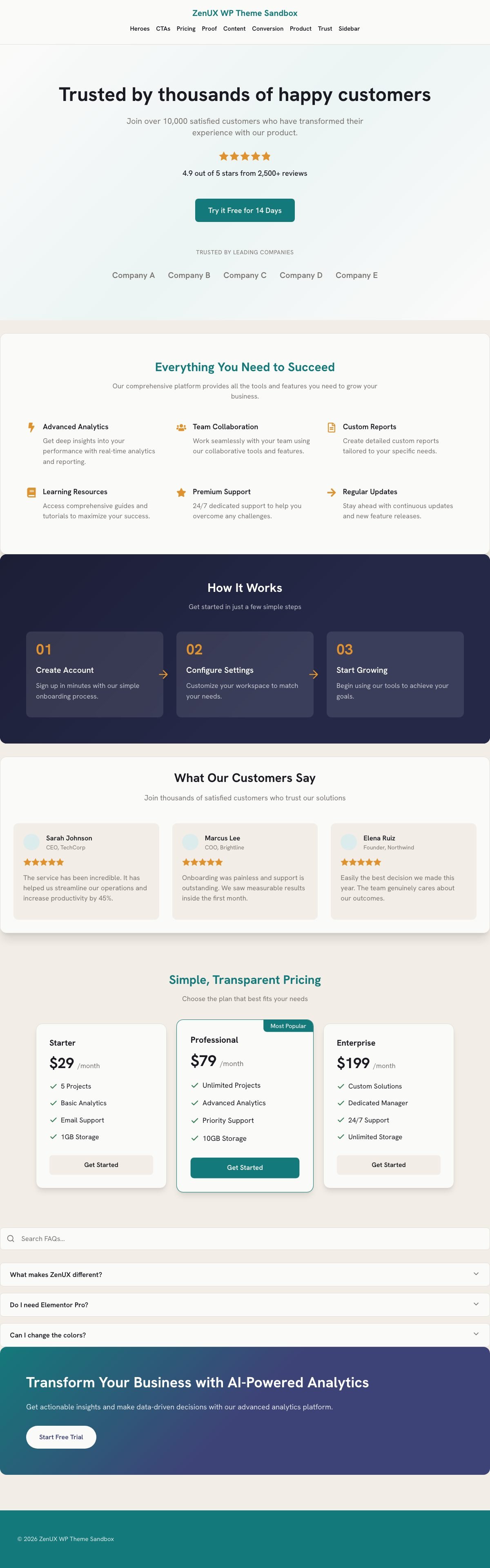
--zx-* variable, click-to-copy, always currentThree complete sites — SaaS, local service, agency — composed entirely from stock patterns. Nothing here was designed for the page; it was placed on it.


Every section you just watched is a stock pattern. Same widgets, three different brands — the token engine does the rest.
Every visible default is a real Elementor control wired to your kit's global tokens — visible in the panel, editable per instance, and connected at the source.
--zx-primarybuttons · links · accents--zx-secondary-900dark bands · footers--zx-accentoffers · highlights--zx-warningribbons · countdowns--zx-surfacecards · section fillsPatterns don't own their colors — they inherit them from your brand tokens. Pick a brand and watch the same widget re-skin itself. On a real site this happens across every page at once, from four color fields and a Save button.
Every review, rating and logo pulls from one shared proof source. Swap the brand and nothing about the content changes — only the clothes.
Most pattern libraries hand you a pretty mockup and a to-do list. These ship wired.
Multi-step navigation, per-step validation, and a shared secure server-side handler. Preset field sets for contact, lead-gen, and downloads.
Set a deadline or let it roll on a 48-hour window. Live, right now, on this page:
One shared rating service feeds every proof pattern — pull your live Google rating or set it manually. No fake five-stars.
The same architecture the respected performance themes use — hooks, hygiene, and nothing you didn't ask for.
zenux_header_before, zenux_content_after… — an injection API for developers, the way Astra and GeneratePress do it.
Declared support with gallery zoom, lightbox, and slider — and product patterns designed to match.
Every widget grouped by family in its own Elementor tab — your components stay separate from your sections.
System-font fallbacks, no jQuery dependencies in patterns, assets loaded only where a pattern is used.
Near-duplicate designs are one widget with a layout style switch — fewer widgets to learn, no drift between twins.
Theme and pattern plugin ship versioned updates through their own update channel — no marketplace middleman.
The theme already runs client sites in production — licensing is next. Leave your email and you'll hear the moment it opens (and nothing else before that).
One email when licenses open. That's it.
Can't wait? Have us build your site on it →